


Which Emblem should I put on my Truck?


 12-31-2011, 01:42 AM
#12
Senior Member
Join Date: Nov 2011
Location: Marshalltown, IA
Posts: 308
Likes: 0
Received 0 Likes
on
0 Posts

Bah, I was thinking of this a few weeks ago, but with a confederate flag. I am not photoshopper though. Was gonna have a tattoo artist draw it lol. =/ Can't do it now. =(

 12-31-2011, 05:02 AM
#14
Senior Member

Join Date: Oct 2011
Posts: 222
Likes: 0
Received 0 Likes
on
0 Posts
x3
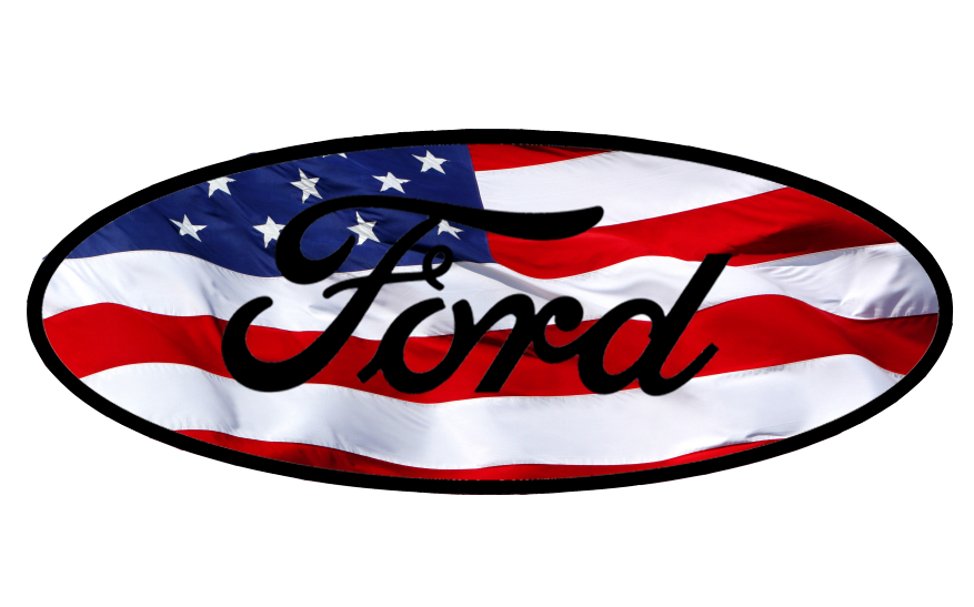
if you are set on it, go with #1, but I think they are both too busy, and I think the black ford on the red white and blue looks a little out of place.
check this one out... I've got the red white and blue, but the blue is ford blue. a couple stars, but not so busy. I got the flag stripes doing a nice lazy curve instead of a ripple. it should play out better at emblem size.
as for the black ring, a best case scenario would be to get that chrome if you could. the stars and ford could be chrome too.
 12-31-2011, 01:21 PM
#17
My favorite would have to be this new one, because it is simpler around the edges, and it still shows off both parts of the flag.
 01-01-2012, 12:11 PM
#19
Senior Member
Yea I agree about the line the stars up. What I did was take a image of the stars and put the two rings in a layer on top and then crop around the outside layer and inside the inner ring away. Then just put that on top of the stripes and layered the ford text back on top.
My favorite would have to be this new one, because it is simpler around the edges, and it still shows off both parts of the flag.
My favorite would have to be this new one, because it is simpler around the edges, and it still shows off both parts of the flag.
01-01-2012, 04:30 PM
#20
